Andrew Freedman at Climate Central and Jeff Masters at Weather Underground are both up today with breakdowns and graphics from the National Oceanic and Atmospheric Administration's (NOAA) monthly State of the Climate summary for June, which has just been released.
The big news is that for the second month in a row, the U.S. has racked up its warmest 12-month period on record (that is, July 2011 through June 2012 topped June 2011 through May 2012, the previous record holder). June 2012 also marked the close of the warmest January-June period on record.
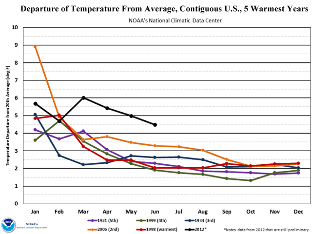
Two of the most notable graphics:
This shows the degree to which 2012--so far--is departing from the four warmest years in the temperature record.
And this shows how far the two 12-month periods ending in May 2012 and June 2012 exceed other 12-month periods in the historical record.
Documenting findings of climate science and the effort to save our planet from the unknowable consequences of the unplanned, ungoverned experiment we are now conducting on its climate. Follow me on Twitter at @climatehawk1.
Showing posts with label capital climate. Show all posts
Monday, July 9, 2012
Sunday, July 8, 2012
By the numbers: U.S. warming
OK, I admit it--I'm a numbers geek, er, guy.
Graphics are good, but numbers are better. It's fun to poke around them and try to understand the story they are telling.
A while ago, inspired by the Great March 2012 Heat Wave, I expressed concern about the ratio of new high daily temperatures across the U.S. to new low daily temperatures. I reposted a graphic from the blog Capital Climate that seemed to me to suggest that the high ratios of months like March 2012 (35:1, here after just "35") and January 2012 (22) indicated that wild swings in temperature are growing greater--that the weather system was looking more and more unstable due to global warming.
The Capital Climate graphic, however, didn't show everything I needed to confirm that hypothesis. In this particular iteration (the blog has published others previously, covering different time periods), only ratios from 2011 and 2012 were shown--not enough to get a feel for just how unusual the March and January ratios were. So I decided to go digging.
A week later (this is tedious and time-consuming work), I've created an Excel spreadsheet that shows new daily highs, new daily lows, and their ratio for months in the years 1993-2012. I also flipped ahead and took a peek at 1988 and 1936, two previous years with remarkable heat waves. All data is from the National Climate Data Center (NCDC) of the National Oceanic and Atmospheric Administration (NOAA), which maintains an online database of temperature extremes at http://www.ncdc.noaa.gov/extremes/records/.
There's still quite a bit of work to do (the database covers years back to 1850!), but even with the limited portion I've completed, there are some interesting results:
First, ratios of new highs to lows in recent years are not toooo extreme. While March 2012 (35) and January 2012 (22) are definitely unusual, there are other wilder outliers in the historical record. January 2006 (58:1) is the biggest I've found so far, and November 1999 (53) and February 2000 (50) also achieved ratios of 50 or better.
Second, there is a clear warming trend. That trend is, I think, best illustrated by looking at some yearly records:
Most recent year in which new daily lows exceeded new daily highs: 1997, with 16,469 new lows versus 15,964 new highs. That's a stopper right there, since if the climate were stable, it would be unusual for there to be 14 straight years (1998 through 2011) in which new highs exceeded new lows.
Most recent year with 20,000 or more new daily lows: 1996 (23,160).
Most recent year with 20,000 or more new daily highs: 2007 (26,067).
One might speculate that the number of new records is decreasing over time as the temperature data set gets longer/larger, but there's no reason for highs to exceed lows unless the average temperature is increasing.
Most recent year with 15,000 or more new daily lows: 2002 (18,166).
Most recent year with 15,000 or more new daily highs: 2012 (18,164 and counting, through July 7).
Pretty hard to refute this very impressive data. 2003, 2005, 2006, 2007, and 2011 also had more than 15,000 new daily highs.
Most recent year with 10,000 or more new daily lows: 2007 (10,355).
2010, 2011, 2012 all surpassed 10,000 new daily highs.
Number of months since January 1, 1993, with a ratio of new lows to new highs exceeding 10:1: 1 (March 1997, with a ratio of 12.7:1).
The following months since that date have had ratios of new highs to new lows exceeding 10:1: January 1995 (17), February 1997 (16), January 1998 (12), July 1998 (16), September 1998 (17), November 1998 (21), December 1998 (14), November 1999 (53), January 2000 (12), February 2000 (53), March 2000 (40), November 2001 (14), December 2001 (12), January 2002 (15), August 2003 (12), October 2003 (11), March 2004 (21), February 2005 (18), January 2006 (58), August 2007 (13), June 2011 (10), August 2011 (22), January 2012 (22) and March 2012 (35)--a total of 24 months in all.
Highest ratio of new highs to new lows for a year: 1998 (4.04).
At the moment, 2012 is on track to easily surpass 1998 (currently, its ratio is a remarkable 11.7), but the record makes it clear that significant changes can take place in a few months.
More generally, this work is inspired not only by the Great June-July 2012 Heat Wave, which we have just finished, but by a study of the ratio of new highs to new lows completed in 2009 by authors from the National Center for Atmospheric Research (NCAR), Climate Central, The Weather Channel, and NOAA. That study found the following ratios by decade:
1950s: 1.09 (to 1)
1960s: 0.77
1970s: 0.78
1980s: 1.14
1990s: 1.36
2000s: 2.04
The decadal record has the effect of smoothing variations and making it clear that since the 1990s, the ratio has taken a jump, with a larger increase from the 1990s to 2000s than any previous change. (I hope to extend this back to at least the 1930s and 1940s, since the Dust Bowl era of the 1930s had multiple very hot summers.)
I'll be continuing to build out my spreadsheet in the coming weeks, and will keep you posted on what I find.
Graphics are good, but numbers are better. It's fun to poke around them and try to understand the story they are telling.
A while ago, inspired by the Great March 2012 Heat Wave, I expressed concern about the ratio of new high daily temperatures across the U.S. to new low daily temperatures. I reposted a graphic from the blog Capital Climate that seemed to me to suggest that the high ratios of months like March 2012 (35:1, here after just "35") and January 2012 (22) indicated that wild swings in temperature are growing greater--that the weather system was looking more and more unstable due to global warming.
The Capital Climate graphic, however, didn't show everything I needed to confirm that hypothesis. In this particular iteration (the blog has published others previously, covering different time periods), only ratios from 2011 and 2012 were shown--not enough to get a feel for just how unusual the March and January ratios were. So I decided to go digging.
A week later (this is tedious and time-consuming work), I've created an Excel spreadsheet that shows new daily highs, new daily lows, and their ratio for months in the years 1993-2012. I also flipped ahead and took a peek at 1988 and 1936, two previous years with remarkable heat waves. All data is from the National Climate Data Center (NCDC) of the National Oceanic and Atmospheric Administration (NOAA), which maintains an online database of temperature extremes at http://www.ncdc.noaa.gov/extremes/records/.
There's still quite a bit of work to do (the database covers years back to 1850!), but even with the limited portion I've completed, there are some interesting results:
First, ratios of new highs to lows in recent years are not toooo extreme. While March 2012 (35) and January 2012 (22) are definitely unusual, there are other wilder outliers in the historical record. January 2006 (58:1) is the biggest I've found so far, and November 1999 (53) and February 2000 (50) also achieved ratios of 50 or better.
Second, there is a clear warming trend. That trend is, I think, best illustrated by looking at some yearly records:
Most recent year in which new daily lows exceeded new daily highs: 1997, with 16,469 new lows versus 15,964 new highs. That's a stopper right there, since if the climate were stable, it would be unusual for there to be 14 straight years (1998 through 2011) in which new highs exceeded new lows.
Most recent year with 20,000 or more new daily lows: 1996 (23,160).
Most recent year with 20,000 or more new daily highs: 2007 (26,067).
One might speculate that the number of new records is decreasing over time as the temperature data set gets longer/larger, but there's no reason for highs to exceed lows unless the average temperature is increasing.
Most recent year with 15,000 or more new daily lows: 2002 (18,166).
Most recent year with 15,000 or more new daily highs: 2012 (18,164 and counting, through July 7).
Pretty hard to refute this very impressive data. 2003, 2005, 2006, 2007, and 2011 also had more than 15,000 new daily highs.
Most recent year with 10,000 or more new daily lows: 2007 (10,355).
2010, 2011, 2012 all surpassed 10,000 new daily highs.
Number of months since January 1, 1993, with a ratio of new lows to new highs exceeding 10:1: 1 (March 1997, with a ratio of 12.7:1).
The following months since that date have had ratios of new highs to new lows exceeding 10:1: January 1995 (17), February 1997 (16), January 1998 (12), July 1998 (16), September 1998 (17), November 1998 (21), December 1998 (14), November 1999 (53), January 2000 (12), February 2000 (53), March 2000 (40), November 2001 (14), December 2001 (12), January 2002 (15), August 2003 (12), October 2003 (11), March 2004 (21), February 2005 (18), January 2006 (58), August 2007 (13), June 2011 (10), August 2011 (22), January 2012 (22) and March 2012 (35)--a total of 24 months in all.
Highest ratio of new highs to new lows for a year: 1998 (4.04).
At the moment, 2012 is on track to easily surpass 1998 (currently, its ratio is a remarkable 11.7), but the record makes it clear that significant changes can take place in a few months.
More generally, this work is inspired not only by the Great June-July 2012 Heat Wave, which we have just finished, but by a study of the ratio of new highs to new lows completed in 2009 by authors from the National Center for Atmospheric Research (NCAR), Climate Central, The Weather Channel, and NOAA. That study found the following ratios by decade:
1950s: 1.09 (to 1)
1960s: 0.77
1970s: 0.78
1980s: 1.14
1990s: 1.36
2000s: 2.04
The decadal record has the effect of smoothing variations and making it clear that since the 1990s, the ratio has taken a jump, with a larger increase from the 1990s to 2000s than any previous change. (I hope to extend this back to at least the 1930s and 1940s, since the Dust Bowl era of the 1930s had multiple very hot summers.)
I'll be continuing to build out my spreadsheet in the coming weeks, and will keep you posted on what I find.
Friday, March 23, 2012
Connecting the dots: The Great March Heat Wave and ... climate
I
had a brief conversation recently with a couple of friends, both committed,
long-standing environmentalists. Both were hesitant to ascribe
the extraordinary heat wave we are currently experiencing here in
Vermont (and that is being felt as far west as the Dakotas) to global
warming.
I told them there was no doubt in my mind about the connection. For the record (as it were), here's why:
The temperatures have been extraordinary, far outside the realm of previous temperature ranges in our region. Sunday's high here was 80 degrees F, breaking the old high record by 16 degrees. Monday the temperature was 79, breaking the old record by 20 degrees. Tuesday, 80, 13 degrees above the old record. Wednesday 81, 10 degrees above the old record. This is just a remarkable run of extreme temperatures. (Today, 84, 11 degrees above the old record--five straight days in which the previous high has been broken by double digits.)
The new high temperature records here and elsewhere across the U.S. dovetail with a pattern that has developed over the past four decades, in which the ratio of new highs to new lows is steadily increasing. This pattern is detailed in two graphics, one from the blog Capital Climate and one from the University Corporation for Atmospheric Research (UCAR) that have been reproduced in two excellent articles at another blog, Climate Progress (see March Madness: This may be an unprecedented event since modern U.S. weather records began in the late 19th Century, March 22, 2012, and Record highs far outpace record lows across U.S., Feb. 11, 2010). The articles are well worth reading and highly recommended for the detail they provide, but here is a quick summary:
Article 1, from February 2010, includes the UCAR graphic, which shows the ratio of new high records to new low records across the U.S. If the climate were not changing, one would expect the ratio to vary around 1:1. Instead, what is actually happening is that the ratio is increasing, and some really wild excursions are taking place. According to the UCAR graphic, the ratios (new highs to new lows) for recent decades look like this:
1950s: 1.09 to 1
1960s: 0.77 to 1
1970s: 0.78 to 1
1980s: 1.14 to 1
1990s: 1.36 to 1
2000s: 2.04 to 1
Article 2, the "March Madness" article from today, includes the Capital Climate graphic, with the monthly ratios for 2011 and 2012: 22 to 1 for August 2011, 22 to 1 for January 2012, and 35 to 1 to date for March 2012. That makes three extraordinary heat waves in the past eight months.

I wish I could say the news is going to get better, but I don't think it is--to me (non-scientist), it looks like we are disturbing a previously stable system and the oscillations will get larger as long as we keep increasing the main input that is the source of the disturbance--the levels of greenhouse gases in the atmosphere.
The "March Madness" article also includes a brief video from The Weather Channel, featuring Senior Meteorologist Stu Ostro. Ostro, formerly skeptical of the findings of climate science, has become a convert in recent years as the weather has increasingly diverged from what's been normal in the past. In Ostro's words, "Something ain't right--it's not business as usual." Indeed.
I told them there was no doubt in my mind about the connection. For the record (as it were), here's why:
The temperatures have been extraordinary, far outside the realm of previous temperature ranges in our region. Sunday's high here was 80 degrees F, breaking the old high record by 16 degrees. Monday the temperature was 79, breaking the old record by 20 degrees. Tuesday, 80, 13 degrees above the old record. Wednesday 81, 10 degrees above the old record. This is just a remarkable run of extreme temperatures. (Today, 84, 11 degrees above the old record--five straight days in which the previous high has been broken by double digits.)
The new high temperature records here and elsewhere across the U.S. dovetail with a pattern that has developed over the past four decades, in which the ratio of new highs to new lows is steadily increasing. This pattern is detailed in two graphics, one from the blog Capital Climate and one from the University Corporation for Atmospheric Research (UCAR) that have been reproduced in two excellent articles at another blog, Climate Progress (see March Madness: This may be an unprecedented event since modern U.S. weather records began in the late 19th Century, March 22, 2012, and Record highs far outpace record lows across U.S., Feb. 11, 2010). The articles are well worth reading and highly recommended for the detail they provide, but here is a quick summary:
Article 1, from February 2010, includes the UCAR graphic, which shows the ratio of new high records to new low records across the U.S. If the climate were not changing, one would expect the ratio to vary around 1:1. Instead, what is actually happening is that the ratio is increasing, and some really wild excursions are taking place. According to the UCAR graphic, the ratios (new highs to new lows) for recent decades look like this:
1950s: 1.09 to 1
1960s: 0.77 to 1
1970s: 0.78 to 1
1980s: 1.14 to 1
1990s: 1.36 to 1
2000s: 2.04 to 1
Article 2, the "March Madness" article from today, includes the Capital Climate graphic, with the monthly ratios for 2011 and 2012: 22 to 1 for August 2011, 22 to 1 for January 2012, and 35 to 1 to date for March 2012. That makes three extraordinary heat waves in the past eight months.
I wish I could say the news is going to get better, but I don't think it is--to me (non-scientist), it looks like we are disturbing a previously stable system and the oscillations will get larger as long as we keep increasing the main input that is the source of the disturbance--the levels of greenhouse gases in the atmosphere.
The "March Madness" article also includes a brief video from The Weather Channel, featuring Senior Meteorologist Stu Ostro. Ostro, formerly skeptical of the findings of climate science, has become a convert in recent years as the weather has increasingly diverged from what's been normal in the past. In Ostro's words, "Something ain't right--it's not business as usual." Indeed.
Subscribe to:
Posts (Atom)

