Twitter button

Monday, September 3, 2012

Indispensable Arctic sea ice graph

A lot of ingenuity has gone into graphics displaying various ways of measuring the Arctic sea ice death spiral.  There are graphs depicting sea ice extent (total area within the outer boundaries of the ice pack), area (extent minus the gaps of water), and volume.  One can find web pages that specialize in mapping past and current measurements of one of these parameters against different trend lines, in an attempt to get a feel for when the ice will disappear entirely, or almost entirely, during the summer.  There is even one that shows the death spiral as a ... spiral ... using a polar coordinate graphing scheme.

I personally find the most useful graph, though, to be this simple bar chart of sea ice volume.  Bar charts are very familiar, so it's easy to understand at a glance, and when it comes to sea ice, volume seems to me like the most important measurement.  Sea ice extent and area "recovered" rapidly last year to "near normal levels," but the all-time record low in both of those parameters this year makes it clear that much of the ice growth last winter was a very thin coating--which is where volume comes in.


Thanks to Lawrence Hamilton of the University of New Hampshire for permission to reproduce it.

What does this graph tell us?

Currently, volume stands at 3,600 cubic kilometers (cu-km), about half what it was as recently as 2008 (7,100 cu-km) and just over one-fifth what it was in 1979 (16.9 cu-km).  Records begin in 1979 because this set of data is from satellite monitoring, which began in that year.

Also, the trend line is obviously sharply down. If you imagine a line connecting the 1979 number and this years, it looks as though it will reach zero sometime within the next decade, perhaps 2018.

A quick review of some basics concerning Arctic sea ice:

- Its melting will not affect sea level rise, because the ice is floating and displacing the same mass of water as is created when it melts.

- Its melting is, however, likely to continue because of the positive feedback loop created when ice, which reflects sunlight, melts to expose open water (less reflective), leading to warmer temperatures.

- Its melting may also be leading to changes in the jet stream and in the weather the jet stream affects further south.

You can learn much, much more on the topic from the Arctic Sea Ice blog, which I cannot recommend too highly as a resource.


Wednesday, August 29, 2012

As the solar odometer turns

We have a new residential solar electric (PV, photovoltaic) system installed about a month ago, and its "odometer" will soon turn over the 5 in 500 kilowatt-hours (kWh) of electricity generated.


It's pretty impressive, just in a mechanical (or rather, non-mechanical) sense.  It just sits there.  Nothing seems to happen, but the kWh generated daily continues to rise.  No muss, no fuss.  Pretty neat.

But I digress.  The reason for this post was to say something about what 500 kWh will represent, when we get there later today or tomorrow.

In terms of energy, it's the equivalent of 15 gallons of gasoline, or enough to drive one of our hybrid autos about 675 miles.

In terms of generating electricity, the numbers are bigger, because the combustion process for fossil fuels wastes energy.  500 kWh is equivalent to burning about 500 pounds of coal, or 35 gallons of diesel oil (New England, where we are located, still burns plenty of diesel oil to generate electricity).

In terms of carbon dioxide (CO2) emissions, the New England utility system gives off about one pound of CO2 per kilowatt-hour of electricity, so our 500 kWh means about 500 pounds of carbon dioxide has been kept out of the atmosphere.

So what?  Well, that's where the numbers get truly impressive, because of the very long life and heat-trapping effect of carbon dioxide. In a post on his blog, Quark Soup, science journalist David Appell quotes David Archer's book, The Long Thaw: How Humans Are Changing the Next 100,000 Years of Earth's Climate, as follows:

"If we add up the total amount of energy trapped by CO2 from the gallon of gas over its atmospheric lifetime, we find that our gallon of gasoline ultimately traps one hundred billion (100,000,000,000) kilocalories of useless and unwanted greenhouse heat."


Burning one gallon of gasoline results in the emission of 19.6 pounds of CO2. That means that one pound of CO2, over its lifetime, traps 100 billion kilocalories divided by 19.6, or 5 billion kilocalories.

Now, I don't know about you, but I don't use kilocalories much on a day-to-day basis, so, how much energy is that?  Using the handy Google converter for units of measure, I find that it is 2 x 10 to the 13th (10e13) joules--still not a very meaningful quantity.  However, one Hiroshima-size atomic bomb releases 63 x 10e12 joules, and one pound of CO2 traps 2 x 10e13 (20 x 10e12) joules.  In other words, just three pounds of CO2 added to the atmosphere, over its lifetime, traps as much heat as released by the Hiroshima bomb (a unit of measure Mr. Appell calls the "hiro").

This in turn means that, in a little over a month, our residential solar system has kept enough CO2 out of the atmosphere to trap the equivalent, over time, of the heat that would be released by 167 Hiroshima bombs.

(It also says a lot about how much heat you're adding, over time, to the climate system with every gallon of gas--about 7 Hiroshima bombs' worth--and why it's silly to claim that the billions of tons of carbon dioxide we're adding to the atmosphere each year have no impact on the climate.  But that's another blog post.)

I expect to use these numbers more in the future, in other posts and in comments on the Internet, so if you find any errors, please let me know (Mr. Appell has made the same offer, and nothing has turned up yet).

UPDATE (Sept. 8, 2012): The odometer now stands at 626 kWh, which means we have passed another minor milestone--the first barrel of oil equivalent (BOE).  Burning a barrel of oil generates about 600 kWh--and produces 940 pounds (almost half a ton) of carbon dioxide.


Sunday, August 26, 2012

Mything in action: Deniers and 'Antarctic warming'

I saw it on Twitter today, so it must be true: several posts in succession, all from self-avowed defenders of the Constitution, liberty, blah blah, etc., to the effect that the "Antarctic has been warming for 600 years."

Hmm, I thought as I added these individuals to my "disappear" list on TweetDeck (a time- and annoyance-saving strategy that makes their future tweets invisible to me), I wonder what that is all about?

As I continued to comb the Web for global warming items to tweet, I came across an article in an Australian publication, Crikey, titled "Antarctic melt alarm as scientists find 'very unusual' warming."  Mystery solved. 

The article's lead paragraph: "Scientists have drilled 364 metres into ice to complete the first ever comprehensive temperature record of the Antarctic Peninsula — and they’ve found evidence of 'very unusual' and dramatic warming over the last century." [emphasis added]

The article goes on to say, indeed, that the peninsula has been warming slowly for 600 years, but takes some pains to explain the reason for concern:

"The research showed that the Peninsula has seen a rapid warming over the past 100 years, but that this has also come on top 600 years of more gradual, natural warming in the region ...

"The leader of the research expedition, Dr Robert Mulvaney from the British Antarctic Survey, said: 'The exceptionally fast warming over the last 100 years came on top of a slower natural climate warming that began around 600 years ago — well before the industrial revolution — so it is possible that we are now seeing the combination of natural and man-made warming in this area.'

"What this means is that climate change is adding significant extra pressure to the Antarctic Peninsula ice sheets that were already seeing some strain from the natural warming in the region." [emphasis added]
Just remove that context and presto, you have a tweet that implies global warming is nothing to worry about, when exactly the opposite is true.
Why now?  Presumably in a transparent and rather desperate attempt to spread a counter to the news that Arctic sea ice melt has hit a new record.
(Disclaimer: I have nothing against the Constitution and liberty--they're great!  But I do wonder sometimes why people act as though they are part of a valiant few who think so.)

Arctic sea ice and 'natural cycles'

It's a favorite climate change denier meme: "It's all natural cycles--the climate is always changing."

So, here is one of the things that is new.  A blogger has taken a graphic from a 2011 scientific paper (Kinnard et al) reconstructing the extent of Arctic sea ice for the past 1,450 years and updated it to show actual observations of the last 12 years:


(Minor caveat: This was posted to the Skeptical Science blog and an astute reader pointed out that it is exaggerated slightly--because of the time of year at which measurements were compared, 2012 should actually be about five dashes higher than it is in the graphic.)

I cannot help but note that this is yet another version of the "hockey stick" shape that shows up in many areas of climate research and that results from the speed with which humanity is impacting the Earth's climate (see, e.g., this similar graphic, in reverse, of surface temperatures of Lake Tanganyika over a similar time frame).

Anyone out there think the above graphic looks like a natural cycle?  If so, please send me a small sample of what you are smoking--I'd like to give it a try.

UPDATE 8/26/12: Joe Romm's excellent Climate Progress blog has an article today titled "Why the Arctic sea ice death spiral matters" that includes the graphic above (minus the extension to 2012) and much more.

Saturday, August 25, 2012

Meltdown continues: 2012 breaking Arctic records

Not too long ago (July 17, to be exact), I wrote here:

"'7. The Arctic Ocean is projected to become nearly ice-free in summer within this century, likely within the next thirty to forty years.' [It's not hard to find people on the Web, who know what they are talking about, who believe this will happen before 2020.  While 2012 is, at this writing, on a record pace for Arctic sea ice melt, it remains to be seen whether a new ultimate summer low will result.  What we can say, however, is that there has been no recovery from the 2007 summer low, which was sharply lower than the summer lows in previous years going back to 1979 (when measurements began). You can check out sea ice area through this wonderful interactive graphic, which provides data by day and year.  You can "erase" years by clicking on them at the right, and if you erase back to 2007, you will see that the summer low was roughly 3 million square kilometers, almost exactly a whopping 25% below the low of 4 million reached in 2006.]"

While all the results are not in yet, and won't be until the potential melting season ends next month, 2012 has now erased the 2007 lows for Arctic sea ice area.  As of today, the ice area reported in Cryosphere Today graphic linked to above stands at 2.65 million square kilometers, well below the '07 low of 2.92 million.  The Arctic Sea Ice blog, which appears in the blog list on the right side of this page, has very deep coverage of Cryosphere Today and the several other ongoing measurements of sea ice (extent, area, volume, etc.).  All of the groups measuring except one are now reporting new records.

What does this mean to us? Joe Romm explores the question in a blog at Climate Progress (otherwise known as the climate section of ThinkProgress): "In particular, a 2012 Geophysical Research Letters study, “Evidence linking Arctic amplification to extreme weather in mid-latitudes,” finds that the loss of Arctic ice favors “extreme weather events that result from prolonged conditions, such as drought, flooding, cold spells, and heat waves.”

Saturday, July 21, 2012

People, not polar bears

That was the title of a session, purportedly on climate change, that I attended at the Netroots Nation 2012 conference for progressive bloggers in Providence several weeks ago.

While the session did contain some good info--in particular one segment that talked about how polling in California had found that African-Americans and Hispanics were more concerned about environmental issues than whites--the general thrust seemed to be more about the need to frame global warming as a social justice issue.  I.e., if only you wine-and-cheese enviros would quit romanticizing about the environment, and join the great social justice movement, then everyone would pay attention to "your" issue.

That bugged me.  It seemed patronizing, and it also seemed to largely miss the point.  I was thinking about it today, and it struck me that it's like titling a session on coal mine safety "Miners, not canaries."

I'm sure some of us in the--what, pro-climate-science community?--have warm feelings about charismatic animals like polar bears, but for many of us, the issue is not so much the poor bears themselves, and what is going to happen to them, but the fact that they are, in essence, the canaries in the global coal mine.  If something is going drastically wrong with their ecology, and threatening their existence, it's a sign that things are out of joint with the global climate system on which the lives of billions of people depend.  Rapid warming in the Arctic is one of the first signs of global warming predicted by climate models, and it is what we are seeing today. As I've mentioned elsewhere, rapid Arctic warming also appears to be causing unexpected changes in the jet stream and in weather all around the Northern Hemisphere.

To be sure, the harshest impacts of global warming will likely be felt by poor people, and it's resulting from actions by industries run by industrial plutocrats, but that doesn't mean it's just a social justice issue.  It's bigger than that.  The canaries are dying, and it's time for all of us to get out of the coal mine.  Now.

Tuesday, July 17, 2012

In other news, the Arctic continues to melt

A friend posted a link to the executive summary of the Arctic Monitoring and Assessment Programme's (AMAP) 2011 report on Snow, Water, Ice and Permafrost in the Arctic (SWIPA).  The executive summary is a mere 28 MB (the full document is 553 pages), which took approximately forever to download on my pathetic Internet connection, so let me save you a little time and trouble by quoting its key findings:

"1. The past six years (2005–2010) have been the warmest period ever recorded in the Arctic. Higher surface air temperatures are driving changes in the cryosphere.

2. There is evidence that two components of the Arctic cryosphere--snow and sea ice--are interacting with the climate system to accelerate warming.  

3. The extent and duration of snow cover and sea ice have decreased across the Arctic. Temperatures in the permafrost have risen by up to 2°C. The southern limit of permafrost has moved northward in Russia and Canada.

4. The largest and most permanent bodies of ice in the Arctic – multiyear sea ice, mountain glaciers, ice caps and the Greenland Ice Sheet – have all been declining 
faster since 2000 than they did in the previous decade.

5. Model projections reported by the Intergovernmental Panel on Climate Change (IPCC) in 2007 underestimated the rates of change now observed in sea ice.  [Deniers rejoice! The IPCC was wrong.  But alas, wrong in the wrong direction.]

6. Maximum snow depth is expected to increase over many areas by 2050, with greatest increases over Siberia. Despite this, average snow cover duration is projected to decline by up to 20% by 2050.

7. The Arctic Ocean is projected to become nearly ice-free in summer within this century, likely within the next thirty to forty years. [It's not hard to find people on the Web, who know what they are talking about, who believe this will happen before 2020.  While 2012 is, at this writing, on a record pace for Arctic sea ice melt, it remains to be seen whether a new ultimate summer low will result.  What we can say, however, is that there has been no recovery from the 2007 summer low, which was sharply lower than the summer lows in previous years going back to 1979 (when measurements began). You can check out sea ice area through this wonderful interactive graphic, which provides data by day and year.  You can "erase" years by clicking on them at the right, and if you erase back to 2007, you will see that the summer low was roughly 3 million square kilometers, almost exactly a whopping 25% below the low of 4 million reached in 2006.]

8. Changes in the cryosphere cause fundamental changes to the characteristics of Arctic ecosystems and in some cases loss of entire habitats. This has consequences for people who receive benefits from Arctic ecosystems. [OK, now I know we are getting into stuff many people who don't live in the Arctic don't care about.  Before you lose interest, though, be sure to check out Key Findings 12 and 13 below.]

9. The observed and expected future changes to the Arctic cryosphere impact Arctic society on many levels. There are challenges, particularly for local communities and traditional ways of life. There are also new opportunities.

10. Transport options and access to resources are radically changed by differences in the distribution and seasonal occurrence of snow, water, ice and permafrost in the Arctic. This affects both daily living and commercial activities.

11. Arctic infrastructure faces increased risks of damage due to changes in the cryosphere, particularly the loss of permafrost and land-fast sea ice.

12. Loss of ice and snow in the Arctic enhances climate warming by increasing absorption of the sun’s energy at the surface of the planet. It could also dramatically increase emissions of carbon dioxide and methane and change large-scale ocean currents. The combined outcome of these effects is not yet known. [Emphasis added. For one of the apparent first unexpected impacts, see Linking Weird Weather to Rapid Warming of the Arctic, by Jennifer Francis, who is studying how the melting Arctic appears to be changing the behavior of the jet stream and causing weather patterns--drought, rainfall, heat--to stay in one place for longer periods. Oops.]

13. Arctic glaciers, ice caps and the Greenland Ice Sheet contributed over 40% of the global sea level rise of around 3 mm per year observed between 2003 and 2008. In the future, global sea level is projected to rise by 0.9–1.6 m by 2100 and Arctic ice loss will make a substantial contribution to this.

14. Everyone who lives, works or does business in the Arctic will need to adapt to changes in the cryosphere. Adaptation also requires leadership from governments and international bodies, and increased investment in infrastructure.

15. There remains a great deal of uncertainty about how fast the Arctic cryosphere will change in the future and what the ultimate impacts of the changes will be. Interactions (‘feedbacks’) between elements of the cryosphere and climate system are particularly uncertain. Concerted monitoring and research is needed to reduce this uncertainty."


Friday, July 13, 2012

Remote Siberian lake holds climate change clues

The following (fascinating) press release is from the National Academy of Sciences.  It bears careful reading.  In very brief, sediment cores from a unique Siberian lake that has never been covered by glaciers allow reconstruction of temperatures over a period of 3 million years, during which temperatures were 4-5 degrees C warmer than at present on at least two occasions.  Such warm periods are too warm for the Greenland ice sheet and also coincide in some cases with melting of the West Antarctic Ice Sheet; this suggests the existence of major amplifying feedbacks in the global climate system.  

Press Release 12-115 
Remote Siberian Lake Holds Clues to Arctic--and Antarctic--Climate Change
Fates of polar ice sheets appear to be linked


Photo of snow and ice covering a building at Lake E in the Russian Arctic.
Keys to climate change lie buried beneath "Lake E" in the Russian Arctic.
Credit and Larger Version
June 21, 2012
Intense warm climate intervals--warmer than scientists thought possible--have occurred in the Arctic over the past 2.8 million years.
That result comes from the first analyses of the longest sediment cores ever retrieved on land. They were obtained from beneath remote, ice-covered Lake El'gygytgyn (pronounced El'gee-git-gin) ("Lake E") in the northeastern Russian Arctic.
The journal Science published the findings this week.
They show that the extreme warm periods in the Arctic correspond closely with times when parts of Antarctica were also ice-free and warm, suggesting a strong connection between Northern and Southern Hemisphere climate.
The polar regions are much more vulnerable to climate change than researchers thought, say the National Science Foundation-(NSF) funded Lake E project's co-chief scientists: Martin Melles of the University of Cologne, Germany; Julie Brigham-Grette of the University of Massachusetts Amherst; and Pavel Minyuk of Russia's North-East Interdisciplinary Scientific Research Institute in Magadan.
The exceptional climate warming in the Arctic, and the inter-hemispheric interdependencies, weren't known before the Lake E studies, the scientists say.
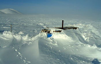
Lake E was formed 3.6 million years ago when a huge meteorite hit Earth, leaving an 11-mile-wide crater. It's been collecting layers of sediment ever since.
The lake is of interest to scientists because it has never been covered by glaciers. That has allowed the uninterrupted build-up of sediment at the bottom of the lake, recording hitherto undiscovered information on climate change.
Cores from Lake E go far back in time, almost 30 times farther than Greenland ice cores covering the past 110,000 years.
The sediment cores from Lake El'gygytgyn reflect the climate and environmental history of the Arctic with great sensitivity, say Brigham-Grette and colleagues.
The physical, chemical and biological properties of Lake E's sediments match the known global glacial/interglacial pattern of the ice ages.
Some warm phases are exceptional, however, marked by extraordinarily high biological activity in the lake, well above that of "regular" climate cycles.
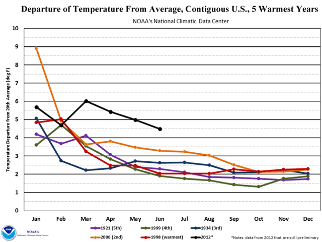
To quantify the climate differences, the scientists studied four warm phases in detail: the two youngest, called "normal" interglacials, from 12,000 years and 125,000 years ago; and two older phases, called "super" interglacials, from 400,000 and 1.1 million years ago.
According to climate reconstructions based on pollen found in sediment cores, summer temperatures and annual precipitation during the super interglacials were about 4 to 5 degrees C warmer, and about 12 inches wetter, than during normal interglacials.
The super interglacial climates suggest that it's nearly impossible for Greenland's ice sheet to have existed in its present form at those times.
Simulations using a state-of-the-art climate model show that the high temperature and precipitation during the super interglacials can't be explained by Earth's orbital parameters or variations in atmospheric greenhouse gases alone, which geologists usually see as driving the glacial/interglacial pattern during ice ages.
That suggests that additional climate feedbacks are at work.
"Improving climate models means that they will better match the data that has been collected," says Paul Filmer, program director in NSF's Division of Earth Sciences, which funded the "Lake E" project along with NSF's Office of Polar Programs.
"The results of this collaboration among scientists in the U.S., Austria, Germany and Russia are providing a challenge for researchers working on climate models: they now need to match results from Antarctica, Greenland--and Lake El'gygytgyn."
Adds Simon Stephenson, director of the Division of Arctic Sciences in NSF's Office of Polar Programs, "This is a significant result from NSF's investment in frontier research during the recent International Polar Year.
"'Lake E' has been a successful partnership in very challenging conditions.  These results make a significant contribution to our understanding of how Earth's climate system works, and improve our understanding of what future climate might be like."
The scientists suspect the trigger for intense interglacials might lie in Antarctica.
Earlier work by the international ANDRILL program discovered recurring intervals when the West Antarctic Ice Sheet melted. (ANDRILL, or the ANtarctic geological DRILLing project, is a collaboration of scientists from five nations--Germany, Italy, New Zealand, the United Kingdom and the United States--to recover geologic records from the Antarctic margin.)
The current Lake E study shows that some of these events match with the super interglacials in the Arctic.
The results are of global significance, they believe, demonstrating strong indications of an ongoing collapse of ice shelves around the Antarctic Peninsula and at the margins of the West Antarctica Ice Sheet--and a potential acceleration in the near future.
The Science paper co-authors discuss two scenarios for future testing that could explain the Northern Hemisphere-Southern Hemisphere climate coupling.
First, they say, reduced glacial ice cover and loss of ice shelves in Antarctica could have limited formation of cold bottom water masses that flow into the North Pacific Ocean and upwell to the surface, resulting in warmer surface waters, higher temperatures and increased precipitation on land.
Alternatively, disintegration of the West Antarctic Ice Sheet may have led to significant global sea level rise and allowed more warm surface water to reach the Arctic Ocean through the Bering Strait.
Lake E's past, say the researchers, could be the key to our global climate future.
The El'gygytgyn Drilling Project also was funded by the International Continental Scientific Drilling Program (ICDP), the German Federal Ministry for Education and Research, Alfred Wegener Institute, GeoForschungsZentrum-Potsdam, the Russian Academy of Sciences Far East Branch, the Russian Foundation for Basic Research, and the Austrian Ministry for Science and Research.
-NSF-
Media ContactsCheryl Dybas, NSF (703) 292-7734 cdybas@nsf.gov
The National Science Foundation (NSF) is an independent federal agency that supports fundamental research and education across all fields of science and engineering. In fiscal year (FY) 2012, its budget is $7.0 billion. NSF funds reach all 50 states through grants to nearly 2,000 colleges, universities and other institutions. Each year, NSF receives over 50,000 competitive requests for funding, and makes about 11,000 new funding awards. NSF also awards nearly $420 million in professional and service contracts yearly.

Update - 13 July 2012: There is an update on the international ANDRILL Antarctic research program's findings available on Real Climate.

Short course in climate at An Open Mind

Tamino, who runs an excellent blog on climate and weather statistical analysis (most of it over my head mathematically :)) at An Open Mind (listed on the right of this page in the blog roll), has a lengthy response today to a lengthy comment on a post concerning the recent U.S. heat wave.  While his response is, as usual, very good, several of the comments are also very educational and provide a good short course on key indicators of climate change.  Recommended.

Monday, July 9, 2012

Hottest 12 months on record, again

Andrew Freedman at Climate Central and Jeff Masters at Weather Underground are both up today with breakdowns and graphics from the National Oceanic and Atmospheric Administration's (NOAA) monthly State of the Climate summary for June, which has just been released.

The big news is that for the second month in a row, the U.S. has racked up its warmest 12-month period on record (that is, July 2011 through June 2012 topped June 2011 through May 2012, the previous record holder).  June 2012 also marked the close of the warmest January-June period on record.

Two of the most notable graphics:


This shows the degree to which 2012--so far--is departing from the four warmest years in the temperature record.


And this shows how far the two 12-month periods ending in May 2012 and June 2012 exceed other 12-month periods in the historical record.

Sunday, July 8, 2012

By the numbers: U.S. warming

OK, I admit it--I'm a numbers geek, er, guy.

Graphics are good, but numbers are better.  It's fun to poke around them and try to understand the story they are telling.

A while ago, inspired by the Great March 2012 Heat Wave, I expressed concern about the ratio of new high daily temperatures across the U.S. to new low daily temperatures.  I reposted a graphic from the blog Capital Climate that seemed to me to suggest that the high ratios of months like March 2012 (35:1, here after just "35") and January 2012 (22) indicated that wild swings in temperature are growing greater--that the weather system was looking more and more unstable due to global warming.

The Capital Climate graphic, however, didn't show everything I needed to confirm that hypothesis. In this particular iteration (the blog has published others previously, covering different time periods), only ratios from 2011 and 2012 were shown--not enough to get a feel for just how unusual the March and January ratios were.  So I decided to go digging.

A week later (this is tedious and time-consuming work), I've created an Excel spreadsheet that shows new daily highs, new daily lows, and their ratio for months in the years 1993-2012.  I also flipped ahead and took a peek at 1988 and 1936, two previous years with remarkable heat waves.  All data is from the National Climate Data Center (NCDC) of the National Oceanic and Atmospheric Administration (NOAA), which maintains an online database of temperature extremes at http://www.ncdc.noaa.gov/extremes/records/.

There's still quite a bit of work to do (the database covers years back to 1850!), but even with the limited portion I've completed, there are some interesting results:

First, ratios of new highs to lows in recent years are not toooo extreme.  While March 2012 (35) and January 2012 (22) are definitely unusual, there are other wilder outliers in the historical record.  January 2006 (58:1) is the biggest I've found so far, and November 1999 (53) and February 2000 (50) also achieved ratios of 50 or better.

Second, there is a clear warming trend.  That trend is, I think, best illustrated by looking at some yearly records:

Most recent year in which new daily lows exceeded new daily highs: 1997, with 16,469 new lows versus 15,964 new highs.  That's a stopper right there, since if the climate were stable, it would be unusual for there to be 14 straight years (1998 through 2011) in which new highs exceeded new lows.

Most recent year with 20,000 or more new daily lows: 1996 (23,160).
Most recent year with 20,000 or more new daily highs: 2007 (26,067).
One might speculate that the number of new records is decreasing over time as the temperature data set gets longer/larger, but there's no reason for highs to exceed lows unless the average temperature is increasing.

Most recent year with 15,000 or more new daily lows: 2002 (18,166).
Most recent year with 15,000 or more new daily highs: 2012 (18,164 and counting, through July 7).
Pretty hard to refute this very impressive data.  2003, 2005, 2006, 2007, and 2011 also had more than 15,000 new daily highs.

Most recent year with 10,000 or more new daily lows: 2007 (10,355).
2010, 2011, 2012 all surpassed 10,000 new daily highs.

Number of months since January 1, 1993, with a ratio of new lows to new highs exceeding 10:1: 1 (March 1997, with a ratio of 12.7:1).
The following months since that date have had ratios of new highs to new lows exceeding 10:1: January 1995 (17), February 1997 (16), January 1998 (12), July 1998 (16), September 1998 (17), November 1998 (21), December 1998 (14), November 1999 (53), January 2000 (12), February 2000 (53), March 2000 (40), November 2001 (14), December 2001 (12), January 2002 (15), August 2003 (12), October 2003 (11), March 2004 (21), February 2005 (18), January 2006 (58), August 2007 (13), June 2011 (10), August 2011 (22), January 2012 (22) and March 2012 (35)--a total of 24 months in all.

Highest ratio of new highs to new lows for a year: 1998 (4.04).
At the moment, 2012 is on track to easily surpass 1998 (currently, its ratio is a remarkable 11.7), but the record makes it clear that significant changes can take place in a few months.

More generally, this work is inspired not only by the Great June-July 2012 Heat Wave, which we have just finished, but by a study of the ratio of new highs to new lows completed in 2009 by authors from the National Center for Atmospheric Research (NCAR), Climate Central, The Weather Channel, and NOAA. That study found the following ratios by decade:

1950s: 1.09 (to 1)
1960s: 0.77
1970s: 0.78
1980s: 1.14
1990s: 1.36
2000s: 2.04

The decadal record has the effect of smoothing variations and making it clear that since the 1990s, the ratio has taken a jump, with a larger increase from the 1990s to 2000s than any previous change.  (I hope to extend this back to at least the 1930s and 1940s, since the Dust Bowl era of the 1930s had multiple very hot summers.)

I'll be continuing to build out my spreadsheet in the coming weeks, and will keep you posted on what I find.

Monday, June 11, 2012

After Pearl Harbor


This article is cross-posted from the blog Thisness of a That with the permission of the author, Gillian King.

Following my comments yesterday about the disparity between the catastrophic potential of climate change and the mild words and actions even of those who accept the science, I was interested to see David Spratt address the same topic,
After Pearl Harbor, the US government told Detroit to stop manufacturing automobiles for private use, and start building tanks and other war materiel. Automobile production was 162,000 in 1941 and zero in 1942. Tank production was <300 in 1940 and 25,000 by 1942.

When the US does act decisively on climate, the government will tell the private sector to stop burning coal and start getting power from renewables within one year, and they will do it because it feasible. The US can't solve the climate crisis unilaterally, so we will pay for China to go solar in exchange for shutting down its coal mines (the two nations control 40% of the worlds coal reserves), just as we couldn't win the war alone, and paid the Soviet Union to keep the second front open.

Our agenda must aim for that level of action, nothing short of it is sufficient, and the details will not be worked out beforehand. Our present agenda, focused on US domestic emissions and anything-is-better-than-nothing, has more in common with the pre-war policies of isolationism and appeasement.
Hear! Hear!

read that the last time CO2 levels were as high as they are today was 15 million years ago. Global temperatures were 5-10°F higher than they are today, the sea level was about 75-120 feet higher than today, there was no permanent sea ice cap in the Arctic and very little ice on Antarctica and Greenland.

The geological record suggests that the current acidification is potentially unparalleled in the last 300 million years of Earth history. Researchers say this is worse than during any of four of the major mass extinctions in history.

What is a proportional response to this situation? I don't think more bicycling and worm farms will do the job. As David McKay says,
If everyone does a little, only a little gets done.

Just as the attack on Pearl Harbour brought a massive response, so it is inevitable that climate change will foster an all-out response at some point.

As individuals we can advocate for change and prepare ourselves by making adaptations ahead of the curve. See the Take Action tab above for things you can do.

Thursday, May 31, 2012

More eye-popping Greenland data

Over at Weather Underground, meteorologist Dr. Jeff Masters has a new post on Greenland, including some recent temperature records and a look at the melting of the giant island's ice cap during 2011:

"The record books for Greenland's climate were re-written on Tuesday, when the mercury hit 24.8°C (76.6°F) at Narsarsuaq, Greenland, on the southern coast. According to weather records researcher Maximiliano Herrera, this is the hottest temperature on record in Greenland for May, and is just 0.7°C (1.3°F) below the hottest temperature ever measured in Greenland. The previous May record was 22.4°C (72.3°F) at Kangerlussuaq (called Sondre Stormfjord in Danish) on May 31, 1991. ...

"Between 2003 - 2009, Greenland lost an average of 250 gigatons [billion tons] of ice per year. In 2011, the loss was 70% greater than that." (This is accompanied by a seriously scary graph showing ice loss from 2003 to 2011.)

To briefly recap the nature of the problem:

- The Greenland ice cap is one of the world's two major land-based ice accumulations along with Antarctica.  "Land-based" is key because when land-based ice melts, it adds to sea level rise. (The Arctic ice cap floats on the ocean, so while it is melting too, that doesn't change sea level.)

- There is enough ice in Greenland's mile-high ice cap to raise global sea levels by 7 meters (23 feet) if it all melts (although that's expected to take hundreds of years to happen).

- Many millions of people live in low-lying coastal areas around the world that will have to be abandoned if sea level continues to rise.

Dr. Masters cites studies that estimate Greenland's current contribution to sea level rise at just 0.7 mm (.03 inches) per year, and expect that rate to double over the next decade.

So, nothing urgent here, just another trend that is headed in the wrong direction and accelerating.  On the other hand, it's also a process that may not be entirely predictable.  See Science News, April 16, 2012, "Greenland may be slip-sliding away due to surface lake melting."

Friday, May 25, 2012

Butterfly declared climate change 'winner'

There is some rejoicing in the global-warming-denial, anti-science camp today.  As usual, it is caused by scientific findings, but ones of which deniers happen to approve.  Today's lucky find: a formerly rare butterfly in the United Kingdom, the brown argus, whose range has rapidly expanded in recent years.

Even the U.K. newspaper The Guardian, which seems to have about the best environmental coverage of any mainstream news source in the world, had the kind of headline that the Heartland Institute (Denier Central) would love: "British butterfly defies doom prediction to thrive in changing climate."  If, of course, the Heartland Institute believed the climate were changing.  Meanwhile, one of the study's coauthors delivered another Heartland-warming sound bite: "There will be winners and losers from climate change."

It is good news--don't get me wrong--but some other outlets' stories had a less perky take.  After a few minutes' perusal, my nominee for one of the most perceptive is Bryan Walsh's "Why an English Butterfly Is a Rare Winner in Global Warming" at Time magazine's EcoCentric blog. Walsh starts off by noting, "Little is expected to benefit from climate change, with the possible exception of air-conditioning manufacturers, popsicle makers and Canada," then reviews the scientific findings about the brown argus, and moves on to this insightful close:

"But the brown argus butterfly is likely to be the exception to climate change, not the rule. Past periods of sudden climate change in the Earth‘s history have led to a reduction in biodiversity and even great extinction waves. If warming keeps up at the expected rate—and we’re doing little to slow it down—far more species will suffer as they attempt to adapt than those likely to succeed, especially since climate change is only one of many other challenges wildlife will face, including habitat loss and degradation. And the big question for 7 billion plus human beings is: will we be able to adapt and even thrive like the brown argus, or will we fail?"  Several good sound bites there too, and more important, an appropriate level of respect for the very complicated planetary climate and environmental system in which we are mucking about.


Thursday, May 24, 2012

Emissions rise. Temperature projections too.

A couple of bad news items on the same day (May 24):

First, the International Energy Agency (IEA) reported that global carbon dioxide emissions in 2011 totaled 31.6 billion metric tons (tonnes), an all-time high and 1.0 billion tonnes (3.2%) above 2010: 

"Coal accounted for 45% of total energy-related CO2 emissions in 2011, followed by oil (35%) and natural gas (20%).

"The 450 Scenario of the IEA’s World Energy Outlook 2011, which sets out an energy pathway consistent with a 50% chance of limiting the increase in the average global temperature to 2°C [3.6 degrees F], requires CO2 emissions to peak at 32.6 [billion tonnes] no later than 2017, i.e., just 1.0 [billion tonnes] above 2011 levels." 

Meanwhile, researchers with a German project called the Climate Action Tracker said their monitoring of countries' progress in meeting their greenhouse gas emission reductions pledges indicates that global warming cannot be contained to 3.5 degrees Celsius (6.3 Fahrenheit):

Marion Vieweg, a policy researcher with German firm Climate Analytics, told AFP the 3.5 C (6.3 F) estimate had been based on the assumption that all countries will meet their pledges, in themselves inadequate, to reduce greenhouse-gas emissions.

"New research has found this is not 'a realistic assumption,' she said, adding that right now 'we can't quantify yet how much above' 3.5 C (6.3 F) Earth will warm."  Climate Action Tracker is a joint effort of Climate Analytics, Ecofys, and the Potsdam Institute for Climate Impact Research.


Update - 25 May 2012: Climate Progress has a new blog that covers the IEA info in more detail, noting that IEA Chief Economist Fatih Birol says the emissions data are "perfectly in line" with a temperature rise of 6 degrees C (11 F), which would be somewhere well beyond catastrophic.

Wednesday, May 23, 2012

Heat threatens leatherback sea turtles in Costa Rica

Endangered leatherback sea turtles on the Pacific coast of Costa Rica are threatened by beaches that are hotter in the past, creating conditions that interfere with normal hatching, according to an article in The New York Times' Green blog by Rachel Nuwer:

"James Spotila, the Betz Chair professor of environmental science at Drexel University in Philadelphia, says that in decades to come, global warming is likely to heat up the beach and kill off turtles. 'They’re facing not just one problem, but a convergence of many negative effects of both people and climate change,' he said in an interview ...

"'I’d say this is yet another example in this mounting pile of how global warming and climate change are threatening animals and plants all over the place,' Dr. Spotila said." (emphasis added)


Sea-level rise threatening? No problem, say lawmakers

Much of eastern North Carolina is low-lying, level land that appears threatened by sea-level rise due to global warming, particularly if some of the more challenging scenarios scientists envision come to pass (more info here on one of these troublesome ideas, by noted climate scientist James Hansen and Makiko Sato).

The legislature of the Tarheel State, however, seems to be considering emulating the fabled approach taken by the medieval King Canute (or Cnut), who some chroniclers say went out to the sea's edge, ordered the tide not to come in, and nearly drowned. Recently, North Carolina's lawmakers elected to ignore a scientific report on the issue and may simply legislate a solution, according to Bill Chameides, dean of Duke University's Nicholas School of the Environment.

Writes Chameides in the Huffington Post: "In late April a revised version of a bill from the state House surfaced in the Senate that would enshrine [the position of a group that has lobbied against the scientific report]. This new bill would:
- limit sea-level rise to historical rates circa 1900,
- specify that sea-level rise may be extrapolated linearly to estimate future rates of rise, and
- disallow consideration of scenarios with accelerated rates of sea-level rise.

"Should this legislation come to fruition, North Carolina would be planning for a sea-level rise of about one foot rather than the scientifically projected three feet by the end of the century. That leaves a whole lot of water unaccounted for. And it could leave whole communities up coastal creeks paying for roads and bridges that no longer make sense to maintain in the face of rising seas."

Fascinating approach.

Tuesday, May 22, 2012

Tropics widening, drought threat grows

A new study in the scientific journal Nature suggests that two human-caused pollutants, black carbon aerosols and tropospheric ozone, are causing the boundary of Earth's tropics to expand, a change which may worsen drought in the subtropics. According to Climate Progress: "Led by climatologist Robert J. Allen, an assistant professor of Earth sciences at the University of California, Riverside, the research team notes that an unabated tropical belt expansion would impact large-scale atmospheric circulation, especially in the subtropics and mid-latitudes. "'If the tropics are moving poleward, then the subtropics will become even drier,' Allen said. 'If a poleward displacement of the mid-latitude storm tracks also occurs, this will shift mid-latitude precipitation poleward, impacting regional agriculture, economy, and society.'"

Climate change wiping out Minnesota moose?

Minnesota moose are suffering what appears to be a rapid population decline, according to this ClimateWire article republished in Scientific American: "[T]he animals that inspired Bullwinkle are not what they were. Here, even healthy bulls -- whose size, strength and rutting prowess make them the undisputed kings of the North Woods -- are dying from what appear to be a combination of exhaustion, exposure, wasting disease triggered by parasites and other maladies."

Monday, April 16, 2012

Justin Gillis on connecting the (climate change) dots

There's an excellent and very insightful Q&A interview with Justin Gillis, the New York Times reporter who recently won Columbia University's 2011 Oakes Award for Distinguished Environmental Journalism, at the Columbia Journalism Review website.

Since I have complained previously about the Times' coverage of climate change (here, here, here, and probably other places as well), it's considerable comfort to know that Mr. Gillis has a largely similar view of what has been happening in the mainstream media on the issue. I'm really impressed with some of the things he has to say:

- "I started taking classes and the more I learned, the more I thought to myself, 'This is the biggest problem we have—bigger than global poverty. Why am I not working on it?'" (emphasis added)

- "One thing I’m seeing—and I see it in our own paper as well as many other news outlets—is that people are covering the crazy weather we’re having and, more often than not, dodging the subject of whether there’s any relationship to climate change. TV weathermen are dodging that subject. Print reporters are dodging the subject ... [I]t’s a bit of a scandal that there’s not enough connecting the dots for people." (emphasis added)

Hear, hear!

My enthusiasm is only tempered by a few things. First, Mr. Gillis essentially waves away a goof in one of his recent stories, which included a paragraph about "climate researchers who question the scientific consensus about global warming ..." and in the very next paragraph quoted Myron Ebell, who is described as a "climate skeptic at the Competitive Enterprise Institute."  This unfortunate combination suggested that Mr. Ebell is a climate researcher, when in fact he is an economist--and an economist who works for a group that has run TV ads extolling the virtues of carbon dioxide, the most important greenhouse gas associated with global warming.

Mr. Gillis's comment on this? "I suppose that in retrospect, given how much complaint there was, I wish I had made clear that Ebell is not a scientist, but an economist. I had quoted him many times before and know who he is, what he does, and what perspective he represents." But, of course, it's not enough that Mr. Gillis knows who Mr. Ebell is--that's essential information, bearing directly on Mr. Ebell's credibility, that should be shared with readers.

I noticed this reference when I read the story and was disturbed (actually, pissed would be more accurate) by it.  Joe Romm noticed it also, and wrote a post at ClimateProgress titled False Balance Lives at the New York Times, which perhaps accounts for the second thing that bothered me--Mr. Gillis taking a swing at Romm a bit later on in the CJR interview: "I think some people, like Joe Romm, would like us to send a bugler in a coat of mail around with the paper every morning playing taps and proclaiming that climate change is a problem."

Well, gosh, Mr. Gillis, if the media isn't going to do that job for us, who will?  As you have correctly said, it's the biggest problem we have, and opinion polls make it clear that the public has no idea of its seriousness.  I for one am really grateful for Joe and the folks at Skeptical Science who are keeping those of us concerned about global warming up to speed and doing battle daily with the incessant river of lies and distortions from those in denial about climate change.

Finally, my enthusiasm is restrained by the fact that the Times and most other papers continue to write about America's new-found abundance of fossil fuels with barely a whisper about global warming. I'll have more to say about this soon.

All of that being said, let me end on an up note--I appreciate Mr. Gillis and his efforts to bring more of a focus on climate change and its likely impacts, to one of the leading newspapers in America, and I wish him every success.  The work he's been doing at the Times is critical, and God knows, we need all the help we can get.

Tuesday, April 10, 2012

Defending climate science and academic freedom

It's pass-the-hat time for Michael E. Mann, the beleaguered climate scientist from Penn State (and author of The Hockey Stick and the Climate Wars) who was targeted two years ago for a witch hunt by Ken Cuccinelli, Virginia's Attorney General.  This is serious stuff, folks--a state attorney general invoking the power of the state to harass a private citizen and eminent climate scientist on the most dubious of grounds.

The witch hunt is over now, and the Washington Post has, fittingly, blistered the Dishonorable Mr. Cuccinelli with a scathing editorial about what a jerk he has been and the taxpayer money he has wasted--but the legal bills remain. Hence the fundraising.

The Climate Science Legal Defense Fund, organized a few months ago, is conducting a drive on Rockethub, a crowdfunding site, to raise $10,000 toward Dr. Mann's legal bills. Those who donate at various levels will receive premiums, as follows:


$25: One t-shirt
$50: Two t-shirts
$75: Three t-shirts
$150: All three t-shirts and a copy of Climate Change: Picturing the Science signed by Joshua Wolfe (www.picturingclimatechange.com)
$300: A hockey stick signed by Mike Mann.
$1000: A 16x20 signed silver gelatin print by Joshua Wolfe.

Much more detail and background at the Rockethub page.  Please consider contributing.  At this writing, with 40 days left, $2,200 (22% of the goal) has been raised--your help is needed.

Monday, April 9, 2012

'You may not be interested in climate change, but climate change is interested in you'

That's the best line in Tom Friedman's terrific column in today's New York Times, pointing out the climate-driven factors that have played an overlooked role in the political uprisings of the Arab Spring (food prices in Tunisia, water shortages in Yemen).  Friedman references Joe Romm's excellent Climate Progress blog as well (congrats, Joe!) and concludes:
[W]e should all remember that quote attributed to Leon Trotsky: "You may not be interested in war, but war is interested in you." Well, you may not be interested in climate change, but climate change is interested in you.
Folks, this is not a hoax. We and the Arabs need to figure out — and fast — more ways to partner to mitigate the environmental threats where we can and to build greater resiliency against those where we can’t. Twenty years from now, this could be all that we’re talking about. [emphasis added]


Wednesday, April 4, 2012

Wall Street Journal – Dr. William Happer is Wrong Again


The following is cross-posted with permission from Scott Mandia's excellent blog, Global Warming: Man or Myth?

Letter sent to Wall Street Journal on March 27, 2012, in reply to Dr. William Happer’s op-ed: Global Warming Models Are Wrong Again which should have been titled “Dr. William Happer is Wrong Again”. My LTE has not been published. I am not surprised.

Scientists tell us that heat-trapping carbon emissions are rising, as are global temperatures, sea levels and the risks associated with climate change. But regular readers of the Wall Street Journal’s opinion page are likely to have exactly the opposite impression. 
By my count, over more than a two year period starting in late 2008, the Journal published only 4 opinion pieces that supported the overwhelming scientific consensus on climate change, but 39 that questioned it, attacked scientists or otherwise misrepresented scientific findings. Those trends have continued in recent months. Meanwhile, 97 percent of publishing climate scientists agree that human activities are significantly altering our climate. And our own National Academy of Sciences tells us, “Climate change is occurring, is caused largely by human activities, and poses significant risks for—and in many cases is already affecting—a broad range of human and natural systems.” 
The latest op-ed attempting to contradict the science is from physicist William Happer who makes the classic mistake of cherry-picking an individual year and counting forward from there to make spurious claims about global temperature trends. 
In reality, the past 35 years have all been hotter than average globally, meaning half of all Americans have never even lived during a year with average or below-average temperatures. Four independent scientific agencies confirm the unmistakable warming trend, as did an analysis (the BEST project) from a former climate change skeptic. 
The Journal’s readers would benefit from more high-quality information about the science and less spin from ideologues. 
Sincerely,
Scott A. Mandia, Professor & Asst. Chair – Physical SciencesT-202 Smithtown Science Bldg., S.C.C.C.533 College Rd.Selden, NY  11784
[For a detailed scientific demolition of Dr. Happer's claims, see Yes, Happer and Spencer, Global Warming Continues by Dana Nuccitelli at Skeptical Science.]

Tuesday, April 3, 2012

Bad news for Bryce as neutrinos come home to roost

Some months ago, I had a good time here poking fun at Robert Bryce, a Senior Fellow at the Manhattan Institute for Public Policy, who authored a column in the Wall Street Journal arguing that since a scientific experiment had apparently found neutrinos traveling faster than the speed of light, all the findings of climate science should be considered up for grabs (see Neutrinos stage speedy rescue from global warming ... whew!, Oct. 9, 2011). No, really, he did.

Unfortunately for Mr. Bryce and his tortured logic, the neutrinos have come home to roost. Late last week, two of the top scientists involved in the experiment, which was conducted at the European high-energy physics CERN laboratory and another research center, resigned after a vote of no confidence by other researchers with whom they had been collaborating.  Just two weeks earlier, a second research group had announced that its testing did not confirm the earlier results. The culprit in the first experiment appears to have been faulty equipment.

So yet another "basis for overturning climate science," and a startlingly flimsy one at that, bites the dust.

Was Mr. Bryce wrong? Well, no, not exactly--all science proceeds by trial and error, and climate science is no exception. It's never "settled," and there are still many areas of uncertainty.  At the same time, his approach was a uniquely counter-factual one: to cast doubt on all of the findings of climate science without challenging any of them.  Very creative, since it required no climate-related evidence whatsoever, but for the same reason, not very convincing.

Here's a modest suggestion, Mr. Bryce: the climate science website Skeptical Science has an excellent and informative page titled 10 Indicators of a Human Fingerprint on Climate Change. That page itself links to another page from the National Oceanic and Atmospheric Administration (NOAA) on a report detailing the reasons why scientists are sure the Earth is warming.  Between the two, there are 20 or more significant findings on which the concept of human-caused climate change rests.  Next time you undertake to overturn climate science, it might be more prudent, and convincing, to present some reasons, based on observations or research results, for doubting one or more of these pillars of the actual science.


Even if you are able to do that, though, John Cook's admonition from the Skeptical Science page bears repeating:
Science isn't a house of cards, ready to topple if you remove one line of evidence. Instead, it's like a jigsaw puzzle. As the body of evidence builds, we get a clearer picture of what's driving our climate. We now have many lines of evidence all pointing to a single, consistent answer - the main driver of global warming is rising carbon dioxide levels from our fossil fuel burning.